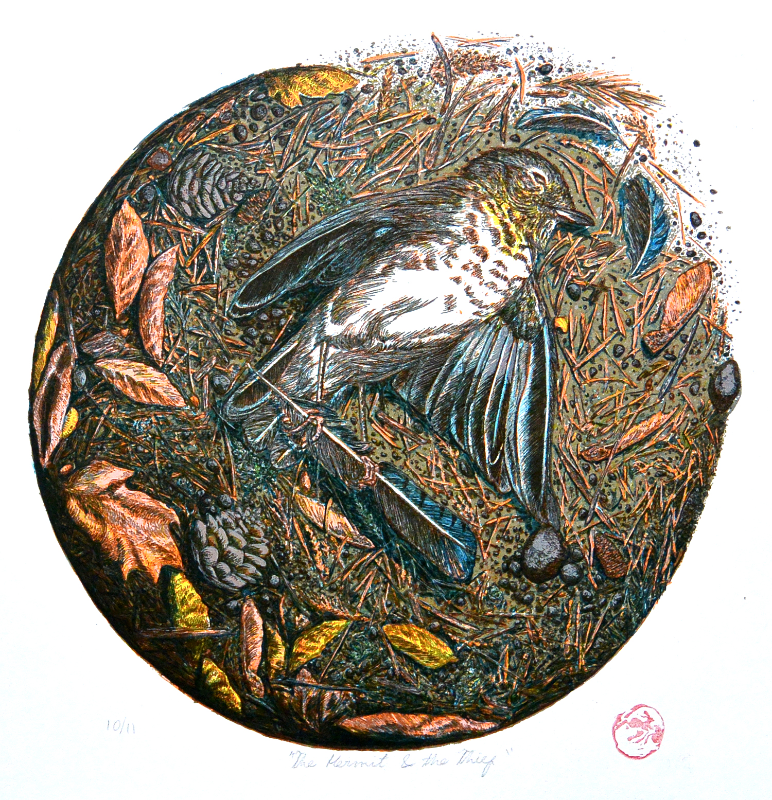
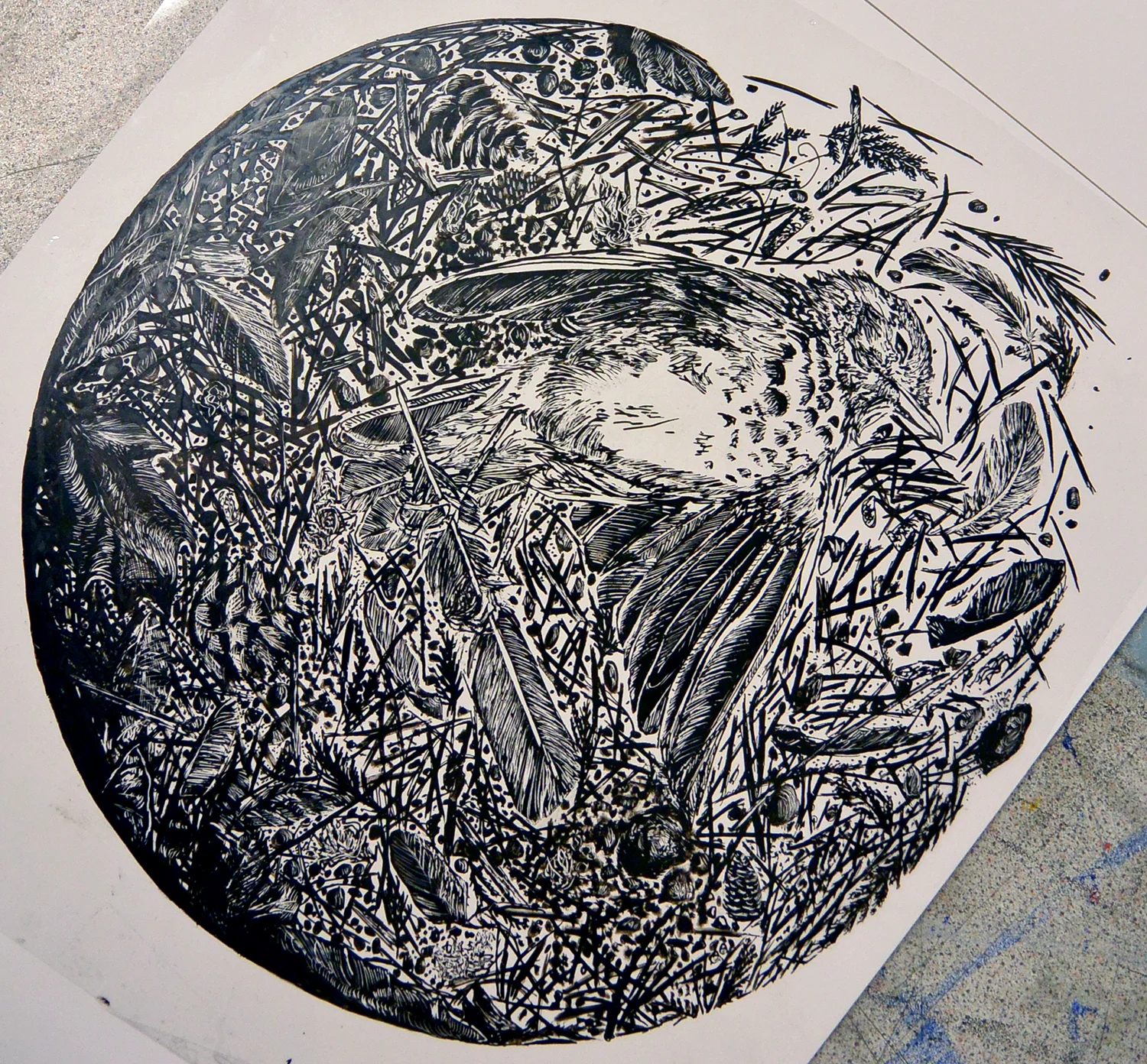
"The Hermit and the Thief" is 14.5 x 20 inches. It depicts a dead hermit thrush holding the feather of a Steller's jay. Steller's jays are notorious nest thieves, and I imagined that the thrush had met an untimely end in pursuit of defending its eggs.
I started this piece one night thinking it would be a small side project, but it inexplixably turned into something that took far more care than I had initially planned. There are 9 layers in all, each one semitransparent so that they interact to create different patterns and textures when they are lain overtop eachother. Transparent layering is not something that is always utilized by contemporary (particularly commercial) screenprinters. I was taught to do things this way so I hold a certain bias, but I am very firm in my belief that it helps to achieve subtelties and textures that you can't get from fully opaque inks.
I used speedball ink mixed with its transparent extender base. I tend to mix the pigmented ink with the transparent base at a ratio that doesn't exceed 50/50, though there are exceptions. The more base you use, the easier it is to pull through the screen and the longer you have before it dries in the pores of the mesh and you have to wash everything out. Halfway through I switched to using exclusively Jacquard ink, which is exceptionally better than speedball. It has a texture like UV ink and tends to go down more smoothly with less 'tack' than speedball. It also seems like you need to mix less pigment with the base, which is remiscent of how I mixed colors when using the UV ink system.
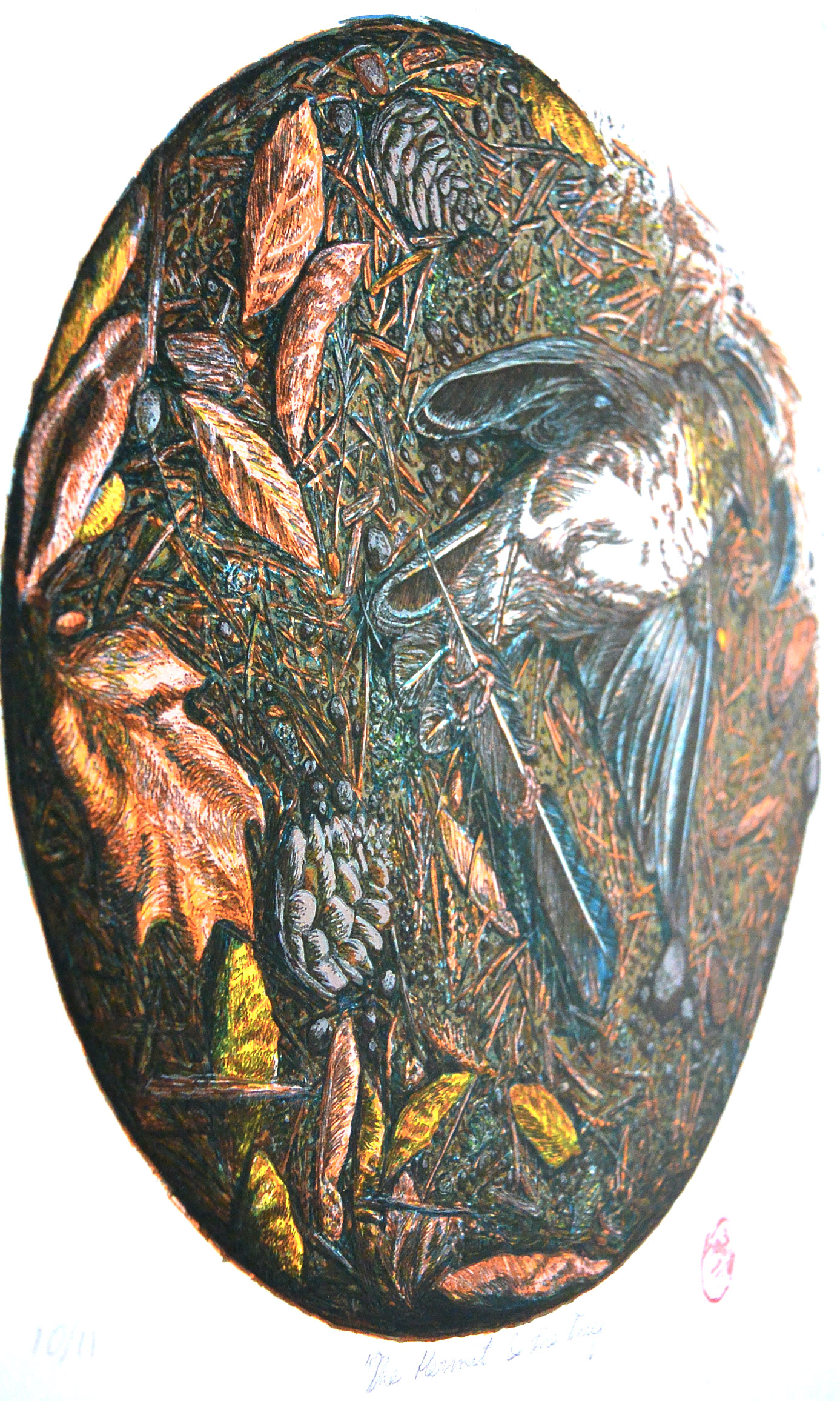
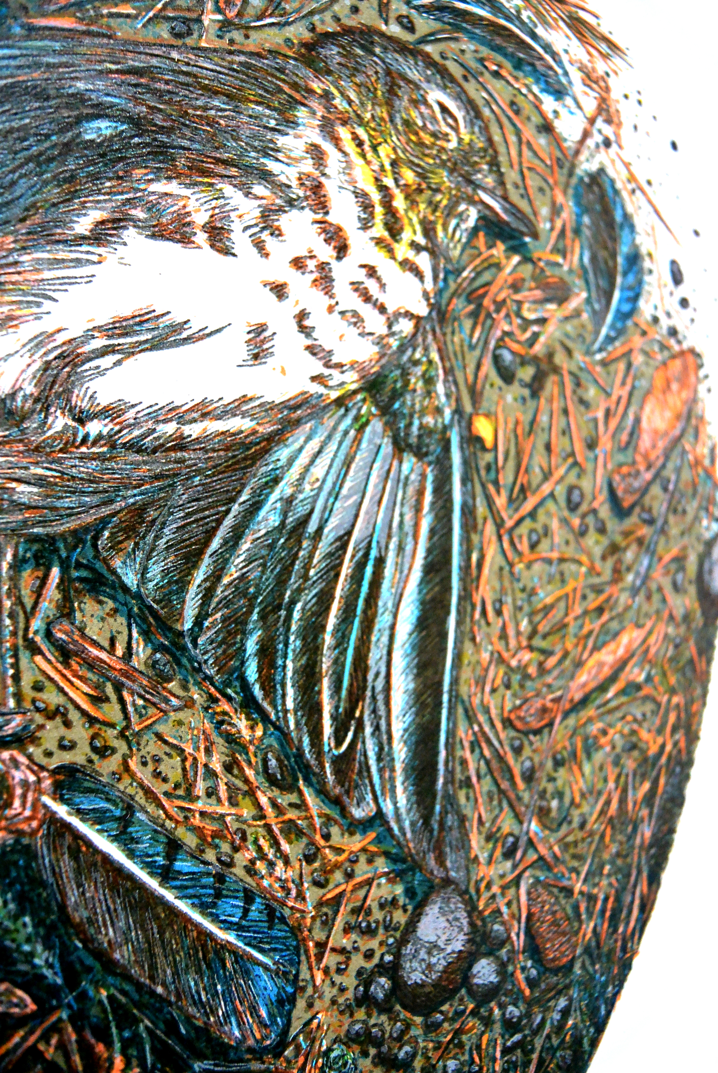
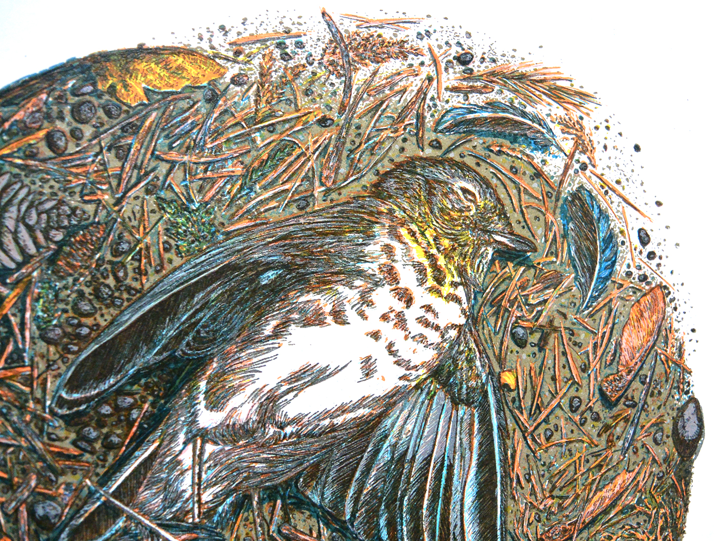
Below, you'll find each layer and it's corresponding positives so you can begin to see how the different transparent layers build upon each other. I apologize that the quality is lacking for some of these photos, I snapped most of them while I was actively printing.
All of my positives are made using india ink. I use a rapidograph pen or just lay it down on the mylar with a paintbrush.

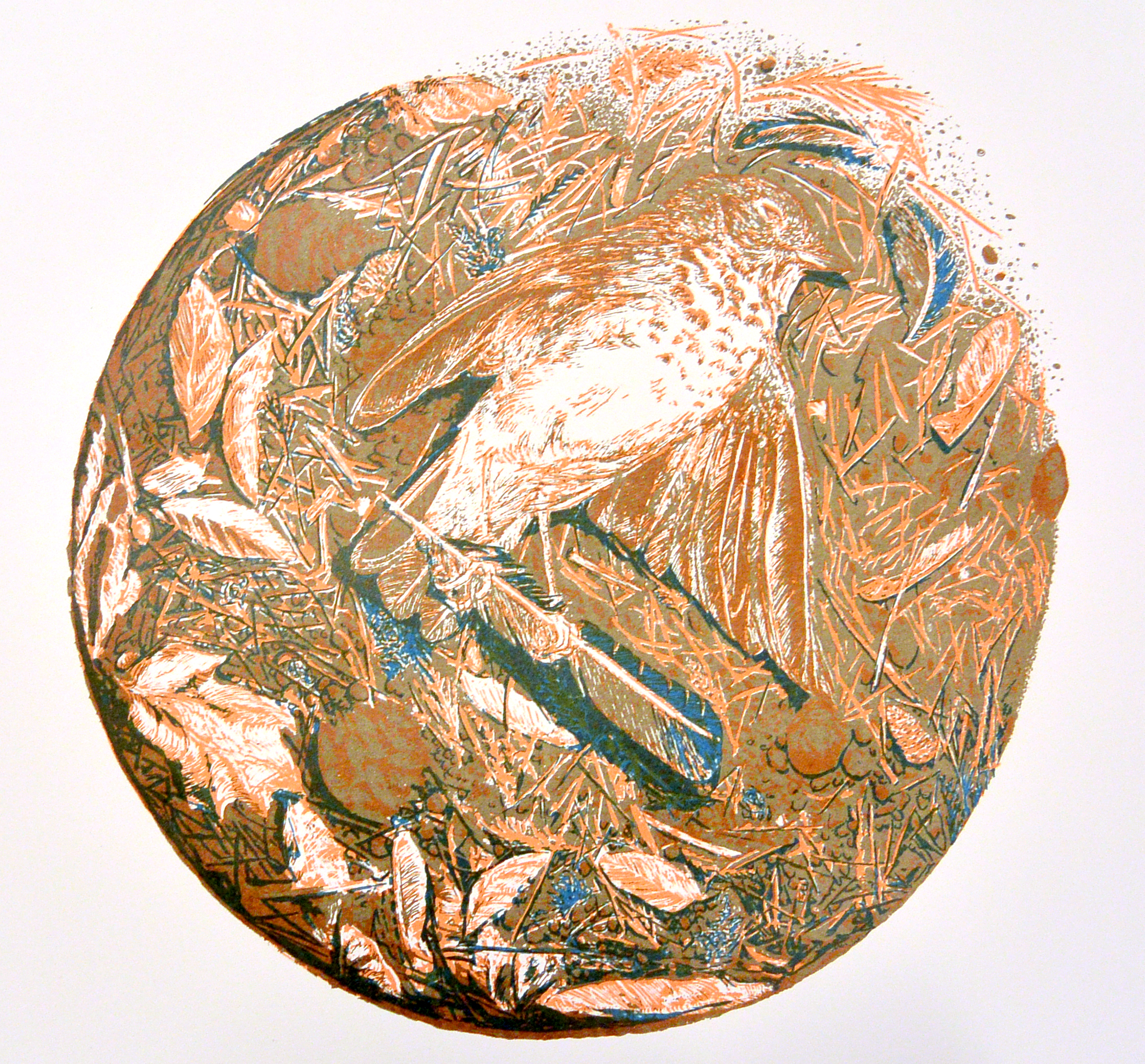
This is the first layer (in the foreground) and the second (behind it), showing the cedar-orange details with the blue shadowing overtop. I decided to print the key image first as a sort of a underpainting, and because it easier for the purposes of registration. That being said, I had some registration issues in the first layer that I didn't notice until the third and had to register things twice or thrice each layer to set things right again.
The positive for layer 1 (the positive for layer 2 is inexplicably lost).
Layer 3, printed in warm gray.

The positive for layer 3 (ignore the conte' stain in the corner)

Layer 4, printed in yellow. When lain overtop of blue it creates green and I added it to the pine cones in order to begin building a brown hue and in other places (like some of the rocks) in order to warm up spots that the light would be hitting.

The positive for layer 4

Layer 5, printed in light blue in order to deepen some of the shadows and cool some of the grays around the wings

The positive for layer 5
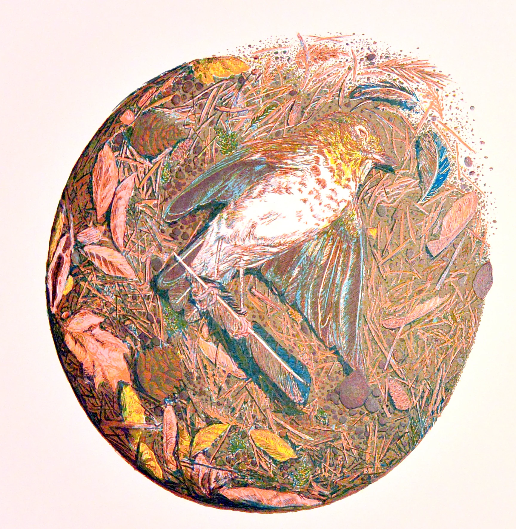
Layer 6, printed it a light magenta/red to give flesh tones to the bird's feet and add hue and detail to certain leaves and debris

The positive for layer 6. Note that for every layer I am trying to add as much depth to the edge debris as possible, building shadows even with warm tones.

Layer 7, printed in light gray. With this layer I wanted to redefine many of the rocks, continue to deepen the shadows and add more texture to the bird's wings.

Positive for layer 7

Layer 8 printed in white to add highlights to certain areas, particularly on the bird since it was getting lost in the background.

The positive for layer 8

Layer 9, printed in dark gray. This final layer redefines pretty much all of the linear detail. The whole edition was split into 2 because I initially printed this layer in black but found I liked a less aggressive tone and printed the rest of the edition in lighter hue.

The positive for layer 9.